Table Show Banner Designs
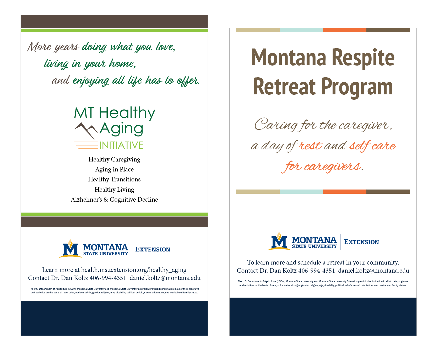
This program needed two banners to use at events to market their services. These table-top banners were designed to be printed on retractable stands. Full-size floor banners were created also.
This program needed two banners to use at events to market their services. These table-top banners were designed to be printed on retractable stands. Full-size floor banners were created also.
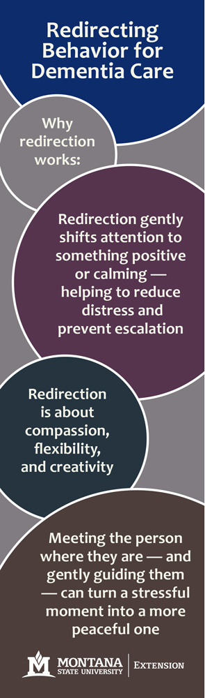
These bookmarks were created as outreach materials for memory care events. Attendees are typically older adults, more likely to read books so they are a perfect option to spread awareness and be kept. I made several options- and even created a custom word-search. All options used the MSU marketing colors to stay on brand.
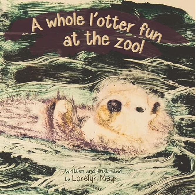
I wrote and designed this children’s book in 2012, after a visit to the Point Defiance View and Aquarium. All the illustrations are paintings created in reverse- first painted on glass and then pressed onto paper. You can purchase a copy of the book on Amazon.
The owner of Frosty Paws Virtual Office wanted her brand and logo to feel retro and involve cats. She wanted to use cat illustrations for print and online marketing materials so I created a series of cats at work in the office.

A local rest home had a fundraiser to earn money toward a new van. I designed this poster for them to mark their progress toward the goal.

These 4″ x 6″ single-sided postcards were designed for a client who wanted to leave them in guest rooms for her overnight guest. They feature her brand colors and a quote she chose.

This project involved some photography and photo editing before making the main illustration. The woman drinking water was created by taking a photo and using that to create the outline.
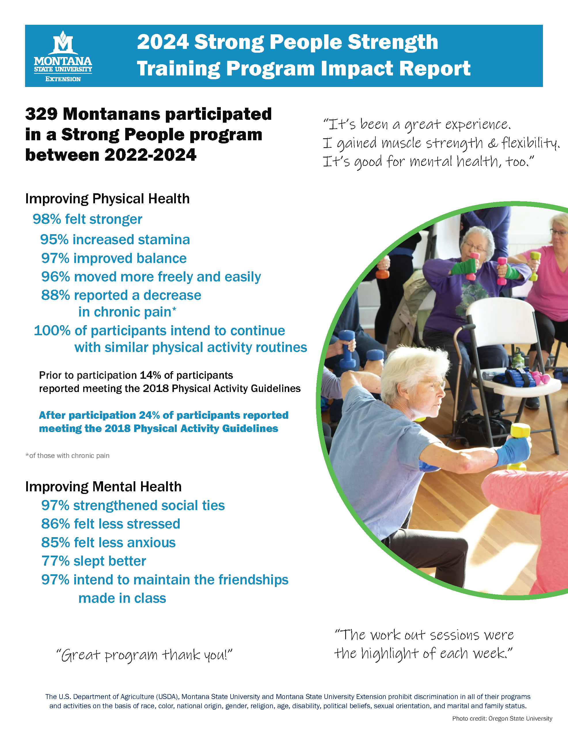
This infographic shares data results from surveys gathered over several years for an exercise program ran by MSU Extension. These single page infographics need to share a large amount of information in an easy-to-read manner.
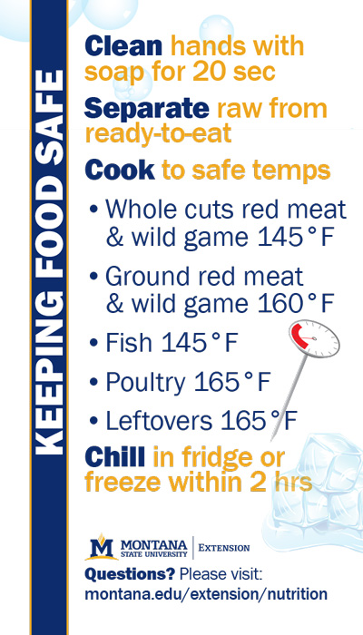
I created this design for MSU Extension Nutrition. It was used as both a magnet and a wallet card to be handed to people attending local events.
This logo design combines imagery of wood grain, a saw blade and the sun setting behind Lone Peak Mountain- the local area of primary business for this client. For the business cards I used a wood-grain background. The cards were printed by Moo on Luxe matte paper, with a blue edge, and round corners giving … Read more